Two films released this year showcase first and foremost a unique architecture in their set designs and an equally unique use of space between the characters and their surroundings. However, one film manages to make a note of its structural choices in the ultimate lesson it attempts to convey. The other film’s choices are as thoughtless as flipping the thin pages of a high-end fashion magazine.
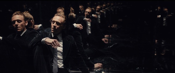
The structural alignment of beams, floors, decks, and their vicinity from the parking lot in Ben Wheatley’s High-Rise is a physical manifestation of social hierarchy and the seperation of economic class. Many British stories, from E.M. Forsters’ Howard’s End and beyond have focused on the disparity and malevolence between the bourgeoisie and those subjected to a lower pedestal and even the sewers of the social strata. In J.G. Ballard’s novel, which Wheatley has, with his signature explosive cinematic style, translated into film, these socio-economic tales of the yesteryears are thrust forward into a quasi-post-apocalyptic world (it seems normal, but something is ominous about the air) where a series of high-rises dominate the landscape and stare down (literally the top of the buildings are tilted slightly so as to seem the building is “looking” downward) to the Earth with a shivering coldness.
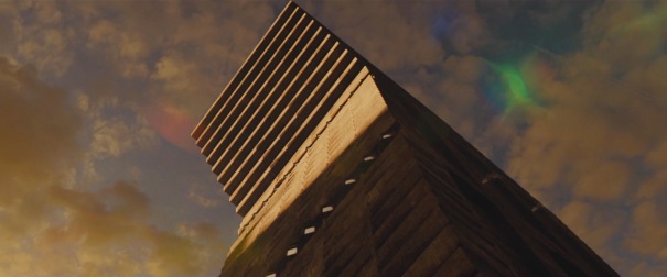
The main protagonist Robert Laing, has an apartment somewhere in the middle of the building. He is perpetually dressed in shirt and tie, to the point where it almost seems that that is his skin (even during sex, he never takes his outfit off). Throughout the film, the architecture of the building gives an aesthetic dimension to its residence’s statuses in society. The top floors (which also host the Architect, the creator of the building) are huge, barren except for the luxurious minimalist furniture that sets itself more like a modern art piece than something to sit on. The clothing is similarly porcelain… clean whites, straight blacks. The lower floors are decorated the way we may decorate our own houses. Pots of plants, pictures kids drew magneted to the refrigerator, some simple paintings and family photos hanging from the walls. The residents clothes have more color and are knitted with designs. Every part of the look of the film is meant to portray the status of a member or group within the “society”. As the war between the lower and upper floors begins to bubble, we start to see foundations shake quite literally… the lobby of the hotel becomes a mess and the cement beams start to chip away. There’s fires in the hallways. One of the bourgeoisie individuals jumps off his balcony to crash and die in the parking lot. A kind of cheeky metaphor of the phrase “the higher you rise the harder you fall”, and quite deliberate in this case, for the parking lot is the only part of the complex where all residents of all floors are on the same level. There’s no turning up one’s nose there because there’s nowhere to go vertically.
High-Rise:


Now on the complete opposite end of the platform, is Nicholas Winding Refn’s latest film, The Neon Demon, one which uses space and structure for nothing other than a “cool look”. While there is a clear metaphorical density to the design of Wheatley’s film, The Neon Demon’s use of architecture is more akin to million-dollar wrapping paper on an empty box. The resulting film is eerily similar to the smug, rotten, and morally defunct interiors of the top floors of the Wheatley’s High-Rise. The characters themselves function more like glass mannequins with no interior working parts. They are quite literally the subject of objectification and the male gaze, and even if the intent of this was to reveal the hollowness of Hollywood’s show-business, there was no attempt by Refn to examine it. Instead, the camera’s central job in this film is to move in lateral motions as the actresses, scantily clad, dolled up to the hilt, stare coldly at one another or into space. Sometimes there’s flickering neon lights. Much of the minimalist scene setting in Refn’s films has existed since Valhalla Rising, but this is the first time it seems like just time-filler. The actresses just take up space.
The Neon Demon:


